Hipstat: visualizing HipChat group chat rooms

Last fall the ElectricAccelerator development team switched to Atlassian HipChat for instant messaging, in place of the venerable Yahoo! Messenger. I’ve written previously about the benefits of instant messaging for development teams, particularly for geographically distributed teams like ours. The main reason for the switch was HipChat’s persistent group chat, which allows us to set up multi-user conversations for product teams. We’ve been using HipChat for several months now, and I thought it might be interesting to do some analysis of the Accelerator team chat room. To that end I wrote hipstat, a Python script which uses matplotlib to generate a variety of visualizations from the data in HipChat’s JSON logs. You can fork hipstat on GitHub — please excuse the non-idiomatic Python usage, as I’m a Python newb.

Team engagement

The first thing I wanted to determine was the level of team engagement: how many people actually use the group chat. You see, for the first few months of our HipChat deployment, the Accelerator chat room was barely used. But it’s a nasty chicken-and-egg problem: if nobody is using the chat room, then nobody will use the chat room. I confess I didn’t use it myself, because it seemed frivolous.

It seemed a shame to let such a resource go unused — I thought that the chat room could be a good way to socialize ideas and share knowledge, maybe not with the same depth of a one-on-one conversation, but surely something would be better than nothing. To get past the chicken-and-egg problem I made a deliberate effort to use the chat room more often myself, in hopes that this would spur other team members to do the same. To guage the level of engagement I graphed the number of active users per day, as well as a simple fit-to-curve calculation to better summarize the data:

Click for full size

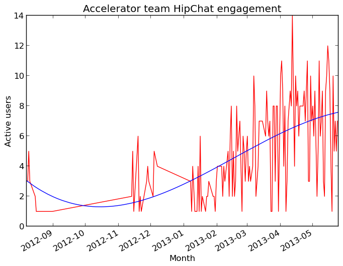
As expected, engagement was low initially but has gradually increased over time. It appears to be plateauing now at about 7-8 users, which is roughly the size of the development team.

Look who’s talking!

Of course my definition of “active user” is pretty lax — a person need only make one comment a day to be considered active. I thought it would be interesting to see which users are speaking most often in the group chat. This graph shows the percentage of total messages from by each user each month since we started using HipChat:

Click for full size!

This graph suggests that I tend to dominate the conversation, at least since I started making an effort to use the chat room — ouch! That’s probably because of my leadership role within the team. Fortunately the most recent data shows other people are speaking up more often, which should lead to a more balanced conversation on the whole.

When are we talking?

Next I wanted to see when the chat room is most active, so I generated a heatmap showing the number of messages sent over the course of each day of the week. Darker blocks indicate a larger number of messages during during that time period:

Click for full size

Not surprisingly, most of the activity is clumped around standard business hours. But there are a couple of peculiar outliers, like the spike in activity just after midnight on Thursday mornings. Turns out that’s primarily conversation between myself and our UK-based teammate. I haven’t figured out yet why that only seems to happen on Thursdays though — except that I often stay up late watching TV on Wednesday nights!

Whatcha talkin’ ’bout, Willis?

Finally, I wondered if there was any insight to be gained by studying the topics we discuss in the chat room. One easy way to do that is a simple word frequency analysis of the words used, and of course the best way to visualize that is with a tag cloud. Hipstat can spit out a list of the most commonly used words in a format suitable for use with Wordle. Here’s the result:

Click for full size!

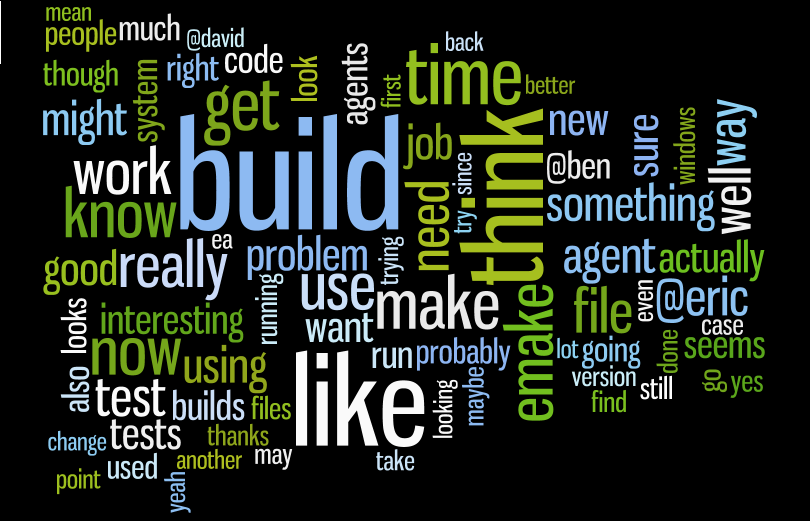
I find this oddly comforting — it’s reassuring to me that the words most often used in our conversations are things like build, time, emake and of course think. I mean, this could have shown that we spend all our time griping about support tickets and infrastructure problems, or even idly chit-chatting about the latest movies. Instead it shows our focus on the problems we’ve set out to solve and, I think, an affirmation of our values.

Hipstat for your HipChat group chat

After several months I think that we are now getting good value out of our HipChat group chat room. It took us a while to warm up to it, but now the chat room serves as a good way to share broad technical information, as well as giving us a “virtual water cooler” for informal conversation.

If you’d like to take a look at your own HipChat group chat logs, you can get hipstat on GitHub. Then you can use the HipChat API to download chat room logs in JSON format. From my trials it seems that the API only allows access to most recent two weeks of logs, so if you want to do analysis over a longer period of time you’ll have to periodically save the logs locally. Then you can generate all of the graphs shown here (except the tag cloud, which requires help from Wordle) using hipstat. For example, to generate the heatmap, you can use hipstat.py –report=heatmap < messages.json to display the result in a window, or add –output=heatmap.png to save the result to a file.

Electric Cloud Customer Summit 2012 by the Numbers

This month saw the fifth annual Electric Cloud Customer Summit, in many ways the best event yet. Located at the historic Dolce Hayes Mansion in San Jose, California, the 2012 Summit had more presentations, more repeat attendees, and more customer and partner involvement than any previous summit. For the first time, we had a “Partner Pavilion” where our customers could meet and learn about offerings from several Electric Cloud partners: Parasoft, Perforce, Opscode, Rally, Klocwork and WindRiver. We also offered in-depth training on ElectricCommander and ElectricAccelerator the day prior to the summit proper, with strong attendance for both.

But the best part of the Electric Cloud Customer Summit? Meeting and speaking with dozens of happy customers. I always leave the summit energized and invigorated, and over the past few days I’ve used that energy to do some analysis of this year’s event. Here’s what I found.

Registration and Attendance

Total registrations hit a record 170 this year, although only 126 people actually made it to the event. That’s a bit less than the 146 we had at the 2011 summit:

Electric Cloud Customer Summit 2012 Registrations and Attendance

More than one-third of the attendees in 2012 had attended at least one previous summit, a new record and a significant increase over the 24% we hit last year. Only three individuals can claim to have attended all five summits (excluding Electric Cloud employees, of course, although including them would not dramatically increase the number):

Electric Cloud Customer Summit 2012 Repeat Attendees

Presentations

The 2012 Summit had more content than any previous year, and more of the presentations came from customers and partners than ever before. I didn’t get a chance to see too many of the presentations, but I did see a couple that really blew me away:

  • Getting the Most Out of Your Development Testing, a joint talk between Parasoft and Electric Cloud, presented a method for accelerating Parasoft’s C/C++test for static analysis. The results were truly exciting — roughly linear speedup, meaning the more cores you throw at it, the faster it will go. In one example, they reduced the analysis time from 107 minutes to just 22 minutes!
  • Aurora Development Service, a talk from Cisco. ElectricAccelerator is a key component of their developer build service, where it provides two tremendous benefits. The first we are all familiar with: faster builds improve developer productivity. The second is less often discussed but no less significant: Accelerator allows Cisco to efficiently share hardware resources among many groups, which means they’ve been able to decommission hundreds of now-surplus servers. In electricity costs alone, that adds up to savings of hundreds of thousands of dollars per year.

Overall, the 2012 Summit included 29 presentations on three technical tracks, including all track sessions, keynotes and training. That’s nearly 20% more than we had in 2011:

Electric Cloud Customer Summit 2012 Presentations

Origins

As usual, the majority of attendees were from the United States, but there were a handful of international users present:

Electric Cloud Customer Summit 2012 Attendees by country

Fourteen US states were represented — oddly, the exact number represented in 2011, but a different set. Naturally, most of the US attendees were from California, but about 30% were from other states:

Electric Cloud Customer Summit 2012 Attendees by state

Industries

Nearly 60 companies sent people to the 2012 summit, representing industries ranging from entertainment and consumer electronics to energy and defense. Here are the industries represented, scaled by the number of people from each:

Electric Cloud Customer Summit 2012 Industries represented

Delegations

Many companies sent only one person, but most sent two or more. Several companies sent 5 or more people!

Electric Cloud Customer Summit 2012 Delegation sizes

Comparing the size of the delegations to the length of time that a company has been a customer reveals an interesting trend: generally speaking, the longer a company has been a customer, the more people they send to the summit:

Electric Cloud Customer Summit 2012 Delegation size versus customer age

Rate of registration

Finally, here’s a look at the rate of registration in the weeks leading up the summit. At last we have a hint as to why there was so little international attendance and probably lower attendance overall: in 2011 promotion for the summit really started about 14 weeks prior, but due to various factors this year, we didn’t really get going until about 9 weeks prior to the event. For many people, and especially for international travellers, that’s just not enough lead time. You can clearly see the impact of our promotional efforts as the rate of registrations kicks into high gear 8 weeks before and remains strong even into the week of the event:

Electric Cloud Customer Summit 2012 Registration rate

The Summit Is Over, Long Live the Summit

The 2012 Summit was a great success, no matter how you slice it. Many thanks to everybody who contributed, as well as everybody that attended. I hope to see you all again at the 2013 Summit!

Electric Cloud Customer Summit 2011 by the Numbers

Earlier this month, Electric Cloud hosted the fourth annual Electric Cloud Customer Summit. By any measure it was a fantastic success, with more people, more content, and lots of enthusiastic and intelligent customers. I thought it would be fun to look at some statistics from this year’s event.

How many people showed up?

The most obvious metric is simply the count of attendees. In 2011, there were 146 attendees (excluding Electric Cloud employees). That’s literally double the number that showed up for the first summit in 2008:

This was the first summit for the majority of those present, but a significant minorty — nearly 25% — had been to at least one previous summit. Several are “Summit All-Stars”, having attended all four!


Who presented?

Another way to measure the growth of the summit is to look at the number of presentations each year, and the proportion of those that were given by customers or partners, rather than by Electric Cloud employees. In 2011, a healthy 40% of the presentations were given by customers and partners, including two panel sessions, and a keynote from GE about how Electric Cloud enabled the transition to agile development:


Where did they come from?

The vast majority of participants were from the United States, but several braved international travel to attend. Here are the countries represented:

Within the United States, 14 states were represented:


How many companies were represented?

This year’s summit was a fantastic place to network, with nearly 60 companies represented, across a wide range of industries. This tag cloud shows the industries, scaled by the number of people from each:

One thing that surprised me is the number of people sent by each company. I expected that most companies would send only one person, but in fact most companies sent at least two. Three companies sent ten or more!


When did attendees register?

I thought it might be interesting to see how far in advance people registered for the summit. It’s not surprising that there’s a spike the week before, although the magnitude of the jump is less than I expected. In fact, less than 25% of the registrations occurred the week before and the week of the summit:


Looking forward to 2012

I had a lot of fun at the 2011 Customer Summit. It was great to finally put faces to the names of people I’ve collaborated with, sometimes for years before meeting face-to-face. And it was a pleasure to see so many familiar faces as well. Here’s hoping the 2012 summit is just as fruitful.

One final thought: if you have any suggestions for additional statistics that might be interesting here, let me know in the comments.

HOWTO: use Gource with Perforce

You may have heard of Gource, the source code control visualization gadget. It’s a utility that creates an animation of the activity in your source control system, giving a unique view of the life of a project over time. I finally got some time to play around with it a couple weeks ago, and I used it to make a video of the development activity on ElectricAccelerator over the past 9 years. The “full length” version is about 30 minutes long and plays on a loop in the breakroom at the office, but here’s a shorter, anonymized version (I recommend putting this or this in the background to provide a soundtrack for the animation):

I don’t think it’s necessarily very useful, but there’s no denying that it’s enthralling to watch, especially when it represents your own project. This visualization does really drive home one thing though: just how active development on ElectricAccelerator is, even now, after 9 years. I used to think that we would be “done” at some point, maybe a few years after we started. Now I think we may never be — in fact, I hope we aren’t!

Integrating Gource and Perforce

Gource is what I call “falling over easy” to use. At least, it is if you’re using one of the source control systems it supports natively. Unfortunately, Gource doesn’t directly support Perforce, our source control system, so to make the video above, I had to convert our Perforce commit logs to a format Gource could handle. That’s not too hard to do actually, and in fact several people have written scripts to do it.

Only trouble is, those adapters don’t handle big projects with many branches very well. Instead, they seem to be designed to handle simple projects with one or a few branches, or to enable visualization of just one of the many branches in your project. Either way, that doesn’t work for us. We’ve got about 30 branches in the Accelerator depot, since we make a new branch for each release, as well as for specific large features that we expect will take a long time to complete, so we can’t simply show all the branches. And if we show just one branch, such as our main branch, the trunk of the tree, the visualization will tend to significantly over-represent my contributions, because I handle most of the cross-branch merges.

So I wrote my own adapter: p42gource.tcl. The key differences in this adapter compared to others are that it incorporates activity from as many branches as you specify; and it ignores branch and integrate operations, since those are merely echoes of “interesting” operations on other branches.

Now, getting from Perforce commit logs to Gource is simple (NB: before using p42gource.tcl, you have to edit it to add the list of branches you want to include in the conversion):

$ # Get the id of the last submitted changelist
$ p4 changes -s submitted -m 1 | awk '{print $2}'
50594
$ # Get the details for each changelist
$ for n in {1..50594} ; do p4 describe -s $n >> p4.log ; done
$ # Create a Gource-style log from the Perforce data
$ tclsh p42gource.tcl < p4.log > gource.log
$ # Run Gource
$ gource --log-format custom gource.log

Give it a try!

Flowviz 2.0.0

Last week I wrote about Flowviz, a workflow visualization plugin for ElectricCommander 3.8 that I put together in the course of one weekend. I was really pleased with how it turned out for the amount of time invested, but I felt that a little more work could really help round out the offering. So, after another weekend of effort (with no football game to distract me!), I am proud now to present Flowviz 2.0.0.

What’s New

The main improvement in Flowviz 2.0.0 is that it provides a way for you to create new transitions when looking at a workflow definition. Flowviz will render a small “+” in the corner of each state; clicking on it will create a new transition starting from that state:

In addition to that major feature, Flowviz 2.0.0 incorporates these minor improvments:

  • Configuration page which allows you to explicitly specify the path to the dot executable.
  • New BSD-based license, so you are free to use and abuse flowviz any way you like.
  • Tested on Windows servers.

Sidebar: injecting the add transition links

It turned out to be somewhat tricky to add the “+” links for the add transition operation. Under the covers, Flowviz uses graphviz to layout and render the workflow in SVG. Unfortunately, graphviz doesn’t provide a way to slap arbitrary additional elements into the render — basically, if you want something to appear in the image, it has to be either a node or an edge.

My first attempt was to simply create an additional node for each “+”. That had two problems: first, graphviz doesn’t provide much control over the size of individual nodes, so I wound up with these big, mostly empty boxes for those nodes, even though they only needed to be big enough to contain the “+”. Second, graphviz doesn’t provide much control over the positioning of individual nodes. Although you can explicitly set the coordinates of a node to an absolute position, there doesn’t seem to be a way to set the coordinates relative to another node — obviously I want the “+” nodes to be close to the state they are associated with.

So, I went back to the drawing board. Eventually, I came up with a new strategy: rather than trying to coerce graphviz to add the links, I would let graphviz do its thing, and then inject the links into the resulting SVG on the fly. SVG is just XML after all, and although it’s a rich language, the way that graphviz uses it is quite stylized. It was easy to scan the SVG output looking for the string class=”node”, the marker for the start of a new node description, then extract the coordinates of the box that represents that node and finally insert a new text element relative to those coordinates. The result is the image you see above: a small, unobtrusive “+” in the corner of each state.

Caveats and limitations

There are still a few limitations to Flowviz 2.0.0:

  1. The workflow definition view does not provide a way to delete states or transitions.
  2. The active workflow view does not support manual transitions with parameters.
  3. Flowviz uses SVG to display the graph. Firefox and Chrome both support SVG natively, but IE requires a client-side plugin.

Flowviz: Workflow Visualization for ElectricCommander

One of the marquee features of the ElectricCommander 3.8 release is a powerful workflow automation engine. It’s pretty slick, but once you get past a handful of states and transitions, it’s hard to keep track of what’s going on. So over the weekend I decided to see if I could write a visualization tool for Commander workflows. The result is Flowviz 1.0, a Commander plugin for graphically displaying workflow definitions and active workflows.

Installing Flowviz

Flowviz is packaged as a standard ElectricCommander plugin, flowviz.jar. Installation is simple: just use the Plugin Manager to install flowviz.jar.

In addition to the Flowviz plugin, you will need to install Graphviz on your Commander server. Packages are available for Linux and Windows, so installation should be relatively painless.

Once you have the pieces installed, you’ll have to set up a Commander view that incorporates Flowviz. I used this view definition:

<view>
  <base>Default</base>
  <tab>
    <label>Flowviz</label>
    <url>pages/Flowviz-1.0/flowviz</url>
  </tab>
</view>

Viewing active workflows

To view an active workflow with Flowviz, first go the Flowviz tab. There you’ll be able to specify the workflow to view, by giving the name of the project and the name of the workflow. Make sure the “Workflow” option is selected, then click the “Show workflow” button:

You’ll be rewarded with an image of your running workflow. The active state will be highlighted, as will any available manual transitions from that state:

Clicking on an available transition will cause the workflow to follow that transition, and then you’ll be returned to the Flowviz visualization:

Viewing workflow definitions

To view a workflow definition with Flowviz, first go to the Flowviz tab. This time, enter the name of a project and the name of a workflow definition. Make sure the “Workflow definition” option is selected, then click the “Show workflow” button:

Flowviz will present a visualization of the specified workflow:

From here, you can add new states by clicking the “Create State Definition” link. Clicking on a node in the graph will take you to the “State Definition Details” page for that state.

Caveats and limitations

There are a few limitations to Flowviz 1.0:

  1. The active workflow view does not support manual transitions with parameters.
  2. The workflow definition view does not provide a way to directly add transitions; to do so, you must first bring up the “State Definition Details” for a state, and then add transitions via that interface.
  3. Flowviz uses SVG to display the graph. Firefox and Chrome both support SVG natively, but IE requires a client-side plugin.
  4. The server-side components of Flowviz have only been tested on Linux. Although I believe they should work (with minor modifications) on Windows, your mileage may vary.

UPDATE (Jan 25): thanks to some feedback from Electric Cloud engineering, I have restructured the plugin to avoid the need for the additional external CGI; the text above has been updated to reflect the new installation instructions.

An Agent Utilization Report for ElectricInsight

A few weeks ago I showed how to determine the number of agents used during an ElectricAccelerator build, using some simple analysis of the annotation file it generates. But, I made the unfortunate choice of a pie chart to display the results, and a couple of readers called me to task for that decision. Pie charts, of course, are notoriously hard to use effectively. So, it was back to the drawing board. After some more experimentation, this is what I came up with:

UPDATE:

Some readers have said that this graph is confusing. Blast! OK, here’s how I read it:

The y-axis is number of agents in use. The x-axis is cumulative build time, so a point at x-coordinate 3000 means that for a total of 3000 seconds the build used that many agents or more. Therefore in the graph above, I can see that this build used 48 agents for about 2200 seconds; it used 47 or more agents for about 2207 seconds; etc.

Similarly, you can determine how long the build ran with N agents by finding the line at y-coordinate N and comparing the x-coordinates of the start and end of that line. For example, in the graph above the line for 1 agent starts at about 3100 seconds and ends at about 4100 seconds, so the build used just one agent for a total of about 1000 seconds.

Here’s what I like about this version:

  • At a glance we can see that this build used 48 agents most of the time, but that it used only one agent for a good chunk of time too.
  • We can get a sense of the health of the build, or it’s parallel-friendliness, by the shape of the curve— a perfect build will have a steep drop-off far to the right; anything less than that indicates an opportunity for improvement.
  • We can see all data points, even those of little significance (for example, this build used exactly 35 agents for several seconds). The pie chart stripped out such data points to avoid cluttering the display.
  • We can plot multiple builds on a single graph.
  • It’s easier to implement than the pie chart.

Here are some more examples:

Example of a build with great parallelismExample of a build with good parallelism
Example of a build with OK parallelismExample of a graph showing two builds at once

A glitch in the matrix

While I was generating these graphs, I ran into an interesting problem: in some cases, the algorithm reported that more agents were in use than there were agents on the cluster! Besides being impossible, this skewed my graphs by needlessly inflating the range of the y-axis. Upon further investigation, I found instances of back-to-back jobs on a single agent with start and end times that overlapped, like this:

<job id="J00000001">
  <timing invoked="1.0000" completed="2.0002" node="linbuild1-1"/>
</job>
<job id="J00000002">
  <timing invoked="2.0000" completed="3.0000" node="linbuild1-1"/>
</job>

Based on this data, it appears that there were two jobs running simultaneously on a single agent. This is obviously incorrect, but the naive algorithm I used last time cannot handle this inconsistency — it will erroneously consider this build to have had two agents in use for the brief interval between 2.0000 seconds and 2.0002 seconds, when in reality there was only one agent in use.

There is a logical explanation for how this can happen — and no, it’s not a bug — but it’s beyond the scope of this article. For now, suffice to say that it is to do with making high-resolution measurements of time on a multi-core system. The more pressing question at the moment is, how do we deal with this inconsistency?

Refining the algorithm

To compensate for overlapping timestamps, I added a preprocessing phase that looks for places where the start time of a job on a given agent is earlier than the end time of the previous job to run on that agent. Any time the algorithm detects this situation, it combines the two jobs into a single “pseudo-job” with the start time of the first job, and the end time of the last job:

    $anno indexagents
    foreach agent [$anno agents] {
        set pseudo(start)  -1
        set pseudo(finish) -1
        foreach job [$anno agent jobs $agent] {
            set start  [$anno job start  $job]
            set finish [$anno job finish $job]
            if { $pseudo(start) == -1 } {
                set pseudo(start)  $start
                set pseudo(finish) $finish
            } else {
                if { int($start * 100) <= int($pseudo(finish) * 100) } {
                    set pseudo(finish) $finish
                } else {
                    lappend events \
                        [list $pseudo(start)  $JOB_START_EVENT] \
                        [list $pseudo(finish) $JOB_END_EVENT]
                    set pseudo(start)  $start
                    set pseudo(finish) $finish
                }
            }
        }
    }

With the data thus triaged, we can continue with the original algorithm: sort the list of start and end events by time, then scan the list, incrementing the count of agents in use for each start event, and decrementing it for each end event.

Availability

You can find the updated code here at GitHub. One comment on packaging: I wrote this version of the code as an ElectricInsight report, rather than as a stand-alone script. The installation instructions are simple:

  1. Download AgentUtilization.tcl
  2. Copy the file to one of the following locations:
    • <install dir>/ElectricInsight/reports
    • (Unix only) $HOME/.ecloud/ElectricInsight/reports
    • (Windows only) %USERPROFILE%/Electric Cloud/ElectricInsight/reports
  3. Restart ElectricInsight.

Give it a try!

Blinkenlights for ElectricAcclerator

Watching builds run is boring. I mean, there’s not really much to look at, besides the build log scrolling by. And the “bursty” nature of the output with ElectricAccelerator makes things even worse, since you’ll get a long pause with no apparent progress, followed by a blast of more output than you can handle — like drinking from a fire hose. Obviously stuff is going on during that long pause, but there’s nothing externally visible. Wouldn’t it be nice to see some kind of indication of the build progressing? Something like this:

I put together this visualization to satisfy my desire for a blinkenlights display for my build. Each light represents an agent used by the build, and it lights up every time a new job is dispatched to that agent. There’s no correlation between the amount of time it takes for the light to fade and the duration of the job, since there’s no way to know a priori how long a job will take. But if the build consists primarily of jobs that are about the same length (and most builds do), then you should see a steady stream of flashes throughout.

–emake-monitor

This visualization is powered by a relative new feature in ElectricAccelerator: add –emake-monitor=host:port to the emake command-line, and emake will broadcast status messages to the specified destination using UDP. As of Accelerator 5.2.0, emake generates four types of status messages. Each message is transmitted in plain text, as a space-separated list of words. The first word indicates the type of message; the remaining words are the parameters of the message:

  • ADD_JOB jobId jobType targetName: a new job has been added to the work queue.
  • START_JOB jobId time agent: a job has started running on the specified agent.
  • FINISH_JOB jobId time: a job has finished running.
  • FINISH_BUILD: the build has completed.

All you need is a program that listens for these messages and does something interesting with them. ElectricInsight is one such program: select the File -> Monitor live build… menu option, enter the same host:port information, and Insight will render the jobs in the build in real time as they run. Not bad, but not as glitzy as I’d like.

Writing blinkenlights

My blinkenlights visualization uses just one of the messages: START_JOB. Each time it receives the message, it maps the agent named in the message to one of the lights, illuminates it, and then fades it at a fixed rate. It’s written in Tcl/Tk, naturally, using a couple great third-party extensions, so the implementation is less than 100 lines of code.

The first extension is Tkpath, which I’ve mentioned previously. I used prect items to create the “lights”, and handled the fading effect by just progressively decreasing the alpha from fully opaque to fully transparent with a series of timer events firing at a predetermined rate.

The second extension is TclUDP, which makes it trivial to connect to a UDP socket from Tcl. Once I have that socket, I can use all the regular Tcl magic like fileevent to make my script automatically respond to the arrival of a new message.

Here’s the code in full:

package require tkpath
package require udp

# fade - update the opacity of the given item to the given value.  Afterwards,
# schedules another event to update the opacity again, to a slightly smaller
# value, until the value reaches zero.

proc fade {id {count 100}} {
    global events
    .c itemconfigure a$id -fillopacity [expr {double($count) / 100}]
    incr count -5
    catch {after cancel $events($id)}
    if { $count >= 0 } {
        set events($id) [after 5 [list fade $id $count]]
    }
}

# next - called whenever there is another message awaiting on the socket.

proc next {sock} {
    global ids
    set msg [read $sock]
    if { [lindex $msg 0] eq "START_JOB" } {
        set agent [lindex $msg 3]
        if { ![info exists ids($agent)] } {
            set ids($agent) [array size ids]
        }
        fade $ids($agent)
    }
}

# Set the dimensions; my test cluster has 16 agents, so I did a 4x4 layout.

set rows 4
set cols 4
set boxx 60
set boxy 60

# Set up the tkpath canvas and the "lights".

set c [::tkp::canvas .c -background black \
           -height [expr {($boxy * $rows) + 5}] \
           -width  [expr {($boxx * $cols) + 5}]]
wm geometry . [expr {($boxx * $cols) + 27}]x[expr {($boxy * $rows) + 27}]

for {set x 0} {$x < $cols} {incr x} {
    for {set y 0} {$y < $rows} {incr y} {
        set x1 [expr {($x * ($boxx + 5)) + 5}]
        set x2 [expr {$x1 + $boxx}]
        set y1 [expr {($y * ($boxy + 5)) + 5}]
        set y2 [expr {$y1 + $boxy}]
        set id [expr {($x * $rows) + $y}]
        .c create prect $x1 $y1 $x2 $y2 -rx 5 -fill #3399cc -tags a$id \
            -fillopacity 0
    }
}
pack .c -expand yes -fill both
wm title . "Cluster Blinkenlights"
update

# Get the host and port number from the command-line.

set host [lindex [split $argv :] 0]
set port [lindex [split $argv :] 1]

# Create the udp socket, set it to non-blocking mode, then set up a fileevent
# that will trigger anytime there's data available on the socket.

set sock [udp_open $port]
fconfigure $sock -buffering none -blocking 0 -remote [list $host $port]
fileevent $sock readable [list next $sock]

# Common idiom to keep the app running indefinitely.

set forever 0
vwait forever

Future work

This is a pretty fun way to monitor the status of a build in progress, but I think there are two things that could make it even better:

  • Watch the entire cluster, instead of just one build. Because this visualization is driven by data streaming from emake, for all practical purposes it’s limited to showing the activity in a single build. I would love to instead be able to view a single display showing the entire cluster, with concurrently running builds flickering in different colors. I think that would be a really interesting display, and might provide some insight into the cluster sharing behaviors of the entire system. I think to really do that properly, we’d need to be intercepting events from every agent, but unfortunately the agent doesn’t have a feature like –emake-monitor.
  • Make it an actual physical gadget. It might be fun to wire together some LED’s, maybe controlled by an arduino or something, to make a tangible device that could sit on my desk. It’s been a long, long time since I’ve done anything like that though. Plus, if there are a lot of agents in the cluster, it may be costly and impractical to manufacture.

What do you think?

Are you using the right colorspace?

If you’re like me, a programmer with no formal UI design training, you’re probably accustomed to working with colors in terms of their RGB values. And, if you’re like me, you’ve probably been frustrated by the seeming irrationality of that colorspace. For example, suppose you want to find the right foreground color for a given background to ensure high legibility. If you’re stuck in RGB-land, there’s no reliable way to get from point A to point B. If you do find a combination that works, the relationship between the two colors often seems arbitrary.

I recently learned that my singular focus on RGB is the problem, because it has no relationship to the way that the human eye perceives color. Switch to a different colorspace, like HSV (for hue, saturation, and value) and voila! Suddenly colors make sense. If you’re doing any sort of UI design, and you’re working exclusively in the RGB colorspace, you’re doing it wrong.

For legibility, use HSV

Unfortunately, I’ve found that there’s no single “best” colorspace. Some problems are better solved in one colorspace, other problems in another. When choosing a text color to maximize legibility against a given background, HSV works really well. Here’s some examples, with the foreground and background colors in both RGB and HSV:

RGB HSV
The quick brown fox … 147 196 147 120 25 77 Foreground
51 68 51 120 25 27 Background
The quick brown fox … 110 127 127 180 13 50 Foreground
221 255 255 180 13 100 Background
The quick brown fox … 51 76 102 210 50 30 Foreground
102 153 204 210 50 80 Background

I could keep going, but I’m sure you see the point: in the RGB colorspace, there’s no predictable relationship between the foreground and background colors. In HSV, it’s a nice, regular pattern. That definitely appeals to the rational programmer in me. If you’re looking for a foreground color yourself, I suggest starting with a delta in value of at least 30.

For gradients, use HSL

When you’re trying to generate a color gradient, I’ve found that the best choice is HSL, for hue, saturation and lightness (note that hue and saturation here have slightly different meanings than in HSV). Here’s an example, with both RGB and HSL values:

RGB HSL
The quick brown fox … 51 149 204 56 60 50
71 160 209 56 60 55
92 170 214 56 60 60
112 181 219 56 60 65
133 191 224 56 60 70
153 202 230 56 60 75
173 213 235 56 60 80
194 223 240 56 60 85
214 234 245 56 60 90

Again, the progression in RGB is awkward and seemingly unpredictable; the progression in HSL is simple.

Is RGB good for anything?

Obviously RGB is good for something: hardware, where colors are literally created by the combination of red, green and blue LED’s (or phosphors, if you’re old school) in varying intensities. That’s why RGB is so prevalent in graphics libraries and programming in general — the concept just bled up through the abstraction layers.

Also, keep in mind that you can convert back-and-forth between RGB and HSV, or RGB and HSL. That means that the RGB values shown above are not really as “arbitrary” as I made them out to be — but the conversions are complex, much too difficult to do in your head. So it’s much easier to work in HSV or HSL, then convert only at the end, just before you have to specify the color to the computer.

I wrote a little Tcl/Tk app that lets me play around with all three colorspaces simultaneously; you’re welcome to it here. If you want to read more about color selection, I highly recommend Choosing Colors for Data Visualization [PDF], by Maureen Stone.

How many agents did my build use?

When you run a parallel build, how many jobs are actually running in parallel during the life of the build? If you’re using ElectricAccelerator, you can load the build annotation file in ElectricInsight and eyeball it, as long as you have a small, uncongested cluster. But if you have a big cluster, and lots of other builds running simultaneously, the build may touch many more distinct agents than it actually uses simultaneously at any given point. It’d be great to see a simple chart like this:

With this graph I can see at a glance that this build used 48 agents most of the time, although there was a lot of time when it used only one agent, probably due to serializations in the build. In this post I’ll show you how to generate a report like this using data from an annotation file.

Counting agents in use

Counting the agents in use over the lifetime of the build is a simple algorithm: make a list of all the job start and end events in the build, sorted by time. Then scan the list, incrementing the count of agents in use every time you find a start event, and decrementing it every time you find an end event. Here’s the code, using annolib, the annotation analysis library:

#!tclsh
load annolib.so

proc CountAgents {annofile} {
    global anno total

    set xml  [open $annofile r]
    set anno [anno create]
    $anno load $xml

    # These values will tell us what type of event we have later.

    set START_EVENT  1
    set END_EVENT   -1

    # Iterate through all the jobs in the build.

    set first [$anno jobs begin]
    set last  [$anno jobs end]
    for {set job $first} {$job != $last} {set job [$anno job next $job]} {
        # Get the timing information for this job.  If this job was not
        # actually run, its timing information will be empty.

        set t [lindex [$anno job timing $job] 0]
        if { [llength $t] == 0 } {
            continue
        }
        foreach {start end agent} $t {
            break
        }

        # Add a start and an end event for this job to the master list.

        lappend events [list $start $START_EVENT] [list $end $END_EVENT]
    }

    # Order the events chronologically.

    set events [lsort -real -increasing -index 0 $events]

    # Scan the list of events.  Every time we see a START event, increment
    # the count of agents in use; every time we see an END event, decrement
    # the count.  This way, "count" always reflects the number of agents
    # in use.

    set count 0
    set last  0
    foreach event $events {
        foreach {t e} $event { break }
        if { ![info exists total($count)] } {
            set total($count) 0
        }

        # Add the time interval between the current and the previous event 
        # to the total time for "count".

        set total($count) [expr {$total($count) + ($t - $last)}]

        # Update the in-use counter.  I chose the event type values
        # so that we can simply add the event type to the counter.

        incr count $e

        # Track the current time, so we can compute the size of the next
        # interval.

        set last $t
    }
}

CountAgents [lindex $argv end]

After this code runs, we’ll have the amount of time spent using one agent, two agents, three agents, etc. in the global array total. The only thing left to do is output the result in a usable form:

set output "-raw"
if { [llength $argv] >= 2 } {
    set output [lindex $argv 0]
}
switch -- $output {
    "-raw" {
        foreach count [lsort -integer [array names total]] {
            if { $total($count) > 0.0001 } {
                puts "$count $total($count)"
            }
        }
    }

    "-text" {
        set duration [$anno duration]
        puts "Agents in use by portion of build time"
        foreach count [lsort -integer [array names total]] {
            set len [expr {round(double($total($count)*70) / $duration)}]
            if { $len > 0 } {
                puts [format "%2d %s" $count [string repeat * $len]]
            }
        }
    }

    "-google" {
        set url "http://chart.apis.google.com/chart"
        append url "?chs=300x225"
        append url "&cht=p"
        append url "&chtt=Agents+in+use+by+portion+of+build+time"
        append url "&chco=3399CC"
        set lbl ""
        set dat ""
        set lblsep ""
        set datsep ""
        set duration [$anno duration]
        foreach count [lsort -integer [array names total]]  {
            set pct [expr {($total($count) * 100) / $duration}]
            if { $pct >= 1.0 } {
                append lbl $lblsep$count
                append dat $datsep[format "%0.2f" $pct]
                set lblsep "|"
                set datsep ","
            }
        }
        append url "&chd=t:$dat"
        append url "&chl=$lbl"
        puts $url
    }
}

This gives us three choices for the output format:

  • -raw, which just dumps the raw data, one entry per line.
  • -text, which formats the data as a simple ASCII bar chart.
  • -google, which emits a Google Charts URL you can put into your browser to see a chart like the one at the top of this post.

For example, if I run this script as tclsh count_agents.tcl -text sample.xml, the output looks like this:

Agents in use by portion of build time 0 *** 1 ***************** 2 *** 3 * 4 * 5 * 47 * 48 ************************************

So that’s it: another trivial annolib script, another slick build visualization!