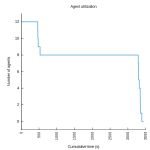
A few weeks ago I showed how to determine the number of agents used during an ElectricAccelerator build, using some simple analysis of the annotation file it generates. But, I made the unfortunate choice of a pie chart to display the results, and a couple of readers called me to task for that decision. Pie charts, of course, are notoriously hard to use effectively. So, it was back to the drawing board. After some more experimentation, this is what I came up with:
Some readers have said that this graph is confusing. Blast! OK, here’s how I read it:
The y-axis is number of agents in use. The x-axis is cumulative build time, so a point at x-coordinate 3000 means that for a total of 3000 seconds the build used that many agents or more. Therefore in the graph above, I can see that this build used 48 agents for about 2200 seconds; it used 47 or more agents for about 2207 seconds; etc.
Similarly, you can determine how long the build ran with N agents by finding the line at y-coordinate N and comparing the x-coordinates of the start and end of that line. For example, in the graph above the line for 1 agent starts at about 3100 seconds and ends at about 4100 seconds, so the build used just one agent for a total of about 1000 seconds.
Here’s what I like about this version:
- At a glance we can see that this build used 48 agents most of the time, but that it used only one agent for a good chunk of time too.
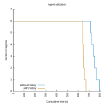
- We can get a sense of the health of the build, or it’s parallel-friendliness, by the shape of the curve— a perfect build will have a steep drop-off far to the right; anything less than that indicates an opportunity for improvement.
- We can see all data points, even those of little significance (for example, this build used exactly 35 agents for several seconds). The pie chart stripped out such data points to avoid cluttering the display.
- We can plot multiple builds on a single graph.
- It’s easier to implement than the pie chart.
Here are some more examples:
A glitch in the matrix
While I was generating these graphs, I ran into an interesting problem: in some cases, the algorithm reported that more agents were in use than there were agents on the cluster! Besides being impossible, this skewed my graphs by needlessly inflating the range of the y-axis. Upon further investigation, I found instances of back-to-back jobs on a single agent with start and end times that overlapped, like this:
<job id="J00000001">
  <timing invoked="1.0000" completed="2.0002" node="linbuild1-1"/>
</job>
<job id="J00000002">
  <timing invoked="2.0000" completed="3.0000" node="linbuild1-1"/>
</job>
Based on this data, it appears that there were two jobs running simultaneously on a single agent. This is obviously incorrect, but the naive algorithm I used last time cannot handle this inconsistency — it will erroneously consider this build to have had two agents in use for the brief interval between 2.0000 seconds and 2.0002 seconds, when in reality there was only one agent in use.
There is a logical explanation for how this can happen — and no, it’s not a bug — but it’s beyond the scope of this article. For now, suffice to say that it is to do with making high-resolution measurements of time on a multi-core system. The more pressing question at the moment is, how do we deal with this inconsistency?
Refining the algorithm
To compensate for overlapping timestamps, I added a preprocessing phase that looks for places where the start time of a job on a given agent is earlier than the end time of the previous job to run on that agent. Any time the algorithm detects this situation, it combines the two jobs into a single “pseudo-job” with the start time of the first job, and the end time of the last job:
    $anno indexagents
    foreach agent [$anno agents] {
        set pseudo(start)  -1
        set pseudo(finish) -1
        foreach job [$anno agent jobs $agent] {
            set start  [$anno job start  $job]
            set finish [$anno job finish $job]
            if { $pseudo(start) == -1 } {
                set pseudo(start)  $start
                set pseudo(finish) $finish
            } else {
                if { int($start * 100) <= int($pseudo(finish) * 100) } {
                    set pseudo(finish) $finish
                } else {
                    lappend events \
                        [list $pseudo(start)  $JOB_START_EVENT] \
                        [list $pseudo(finish) $JOB_END_EVENT]
                    set pseudo(start)  $start
                    set pseudo(finish) $finish
                }
            }
        }
    }
With the data thus triaged, we can continue with the original algorithm: sort the list of start and end events by time, then scan the list, incrementing the count of agents in use for each start event, and decrementing it for each end event.
Availability
You can find the updated code here at GitHub. One comment on packaging: I wrote this version of the code as an ElectricInsight report, rather than as a stand-alone script. The installation instructions are simple:
- Download AgentUtilization.tcl
- Copy the file to one of the following locations:
- <install dir>/ElectricInsight/reports
- (Unix only) $HOME/.ecloud/ElectricInsight/reports
- (Windows only) %USERPROFILE%/Electric Cloud/ElectricInsight/reports
- Restart ElectricInsight.
Give it a try!


Interesting. Is there a way to save the chart from einsight ?
Our production non-recursive build looks very like a reflection of the upper right example above 😦
@Dave: that’s a great suggestion, unfortunately there’s not a way to do that at this time. Best I can suggest is a screen capture.
I tried modifying it to create an Img from the canvas, and then to write that out as a file, but the union of my Tcl skills and what I can find for documentation and examples of Img are insufficient.
Since all I can see is your plugin, I can only speculate; but for every report which is a canvas, it seems like it should be easy to create an ‘export’ button to create an image file.
Some of the non-graphic reports which lack export buttons could use them.
I guess this doesn’t really all belong on your blog 🙂
Ah, I didn’t realize you were willing to roll up your sleeves and get your hands dirty with the code! Creating a Tk [photo] object and translating the points to that would probably work, but maybe isn’t worth the effort. You could also use the canvas built-in postscript generation features (as in [pathName postscript -file out.ps]). Still not sure it’s worth the effort, compared to just getting a screen capture though! In any case, definitely this is a feature worth exploring in the future. And I don’t mind having the discussion here, always happy to hear about how people are using my code and how I can make it more useful.
I also tried just printing the x y values; when I draw those with a different tool, the shape is very different from that. I’ll email the images to you.
I’m just playing around with this, so it’s not worth your time to pursue it.
Thanks,
dt
Nor worth my time: my image was generated with data from a broken build. When I reran einsight to compare against my image, the build had been fixed. In the broken build
almost every compile failed, so very few jobs ran more than a couple of seconds. It was interesting that the longest jobs were almost the same for both cases. That didn’t make sense to me, until I realized that even in the successful build, the two longest jobs are parse jobs.
That is interesting! A little disappointing too though, I never like to see builds with long parse jobs. You might consider collecting emake performance metrics for those parse jobs (with –emake-rdebug=g –emake-rlogdir=.) and sending those to support@electric-cloud.com.
One thing to note is that the plotting style I’m using is “steps” or “fsteps”, rather than a simple line graph. The difference is that steps draws lines from x0,y1 to x1,y1; then x1,y2 to x2,y2; etc., versus just drawing lines from x0,y0 to x1,y1, etc.