Public versus private clouds for dev/test

I recently wrote about our experience migrating to cloud computing to support development and QA activities. Our cloud enables us to support more platforms, at lower cost, and with less complexity than the fleet of physical servers it replaced. But I didn’t have room to talk about one important decision in our migration: whether to build a private cloud or use an existing public cloud like Amazon EC2 or Rackspace Cloud.

For us, the decision was easy. The public cloud is unsuitable for three reasons: platforms, bandwidth and money. First, the public cloud doesn’t support the platforms we need for testing. Second, uploading data to the public cloud takes way too long by today’s agile, continuous development standards. Finally, and probably most interesting to you, the public cloud is surprisingly expensive. In fact, I estimate that the public cloud would cost us more than twice as much as our private cloud, every year.

Public clouds don’t support all of our platforms

My product is supported on a smörgåsbord of x86-based platforms — various incarnations of Windows, from XP to Vista to Windows 7; and a variety of Linux distributions from RHEL4 to Ubuntu 10. Our quality standards demand that we run the platform-dependent portion of our test suite on every supported platform. Pretty standard stuff, I imagine. Too bad for us then that you can’t run XP, Vista or 7 in the cloud (see also here and here).

Bandwidth to the public cloud stinks

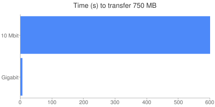
My company is connected to the Internet via a puny 10 Mbit EoC pipe. In comparison, our internal network uses fat GigE connections. Under ideal conditions, it takes 100x longer to transfer data to the public cloud than to our private cloud. Think about that for a second. Heck, think about it for 600 seconds: that’s how long it would take me to upload 750 MB, the total size of our install packages. And that’s best case. When’s the last time you hit the advertised upload speed on your Internet connection?

Transferring those files on our intranet requires a barely measurable 6 seconds:

Time (s) to transfer 750 MB

Adding that kind of delay to our CI builds is just not acceptable.

The public cloud is expensive

Many people assume that the public cloud will be cheaper than a private cloud. A day’s worth of compute time on Amazon EC2 costs less than a Starbucks latte, and you have no upfront cost, unlike a private cloud which has substantial upfront capital expenses. But it pays to run the numbers. In our case, the public cloud is more than twice the cost of a private cloud:

Public vs private cloud cost comparison

I split the costs into two buckets, because we have two fundamentally different usage models for the VM’s in our cloud. First are the systems used by our continuous integration server to run automated tests. Each CI build uses 12 Linux and 8 Windows systems, one for each supported platform. Our testing standards require that those systems are dual-core, but the work load is light since they just run unit tests and simple system tests. We have three such blocks of 20 systems, so we can run three CI builds simultaneously. Because the CI server never sleeps, these systems are always on.

Second are the systems used day-to-day by developers for testing and debugging. Each developer may use just a few systems, or more than a dozen depending on their needs. It’s hard to pin down the precise duty cycle, but eyeballing data from our cloud servers I estimate we have about 80 systems in use per day, for about 8 hours each. They are split roughly 50/50 between Linux and Windows. Two-thirds of the systems are single-core, and the rest are at least dual-core.

Pricing the public cloud

Once you know the type and quantity of VM’s you need, and for how long, it’s straightforward to compute the cost of the public cloud. Because I’m most familiar with Amazon EC2, I’ll use their pricing model. For our CI systems, we would use a mix of Medium and Large instances to match our requirements for multi-core and 64-bit support. Because they are always-on, we’d opt to use the Reserved instance pricing, which offers a lower hourly cost in exchange for a fixed up-front reservation fee.

For developer systems, we would use On-Demand instances, with a mix of Small and Large instances:

Continuous integration systems
Medium instances
Annual fee = $15,015.00 (33 systems at $455 per system)
Linux usage fee = $14,716.80 (21 systems, 24 hours, 365 days, $0.08 per hour per system)
Windows usage fee = $15,242.40 (12 systems, 24 hours, 365 days, $0.145 per hour per system)
Large instances
Annual fee = $24,570.00 (27 systems at $910 per system)
Linux usage fee = $21,024.00 (15 systems, 24 hours, 365 days, $0.16 per hour per system)
Windows usage fee = $25,228.80 (12 systems, 24 hours, 365 days, $0.24 per hour per system)
Subtotal = $115,797.00
Development systems
Small instances
Linux = $4,940.00 (26 systems, 8 hours, 250 days, $0.095 per hour per system)
Windows = $6,760.00 (26 systems, 8 hours, 250 days, $0.13 per hour per system)
Large instances
Linux = $10,640.00 (14 systems, 8 hours, 250 days, $0.38 per hour per system)
Windows = $15,600.00 (14 systems, 8 hours, 250 days, $0.52 per hour per system)
Subtotal = $37,940.00
Total = $153,737.00

Pricing the private cloud

It’s somewhat harder to compute the cost of a private cloud, because there is a greater variety of line-item costs, and they cannot all be easily calculated. The most obvious cost is that of the hardware itself. We use dual quad-core servers which cost about $3,000 each. Six of these servers host our CI VM’s. Note that this is only 48 physical cores, but our CI VM’s use a total of 120 virtual cores. This is called oversubscription, and it works because the load on the virtual cores is light — if each virtual core is active only 30-50% of the time, then one physical core can support 2-3 virtual cores.

We use 15 servers for our on-demand development VM’s. Unlike the CI systems, these VM’s are subject to heavy load, so we cannot oversubscribe the hardware to the same degree.

The next obvious cost is the electricity to power our servers, and of course the A/C costs to keep everything cool. Our electrical rate is about $0.17 per KWh, and we estimate the cooling cost at about 50% of the electrical cost.

Finally, we must consider the cost to maintain our 21 VM servers. To compute that amount, we must first determine how much of a sysadmin’s time will be spent managing these servers. Data from multiple sources shows that a sysadmin can maintain at least 100 servers, particularly if they are homogeneous as these are. Our servers therefore consume at most 21% of a sysadmin’s time.

Next, we have to determine the cost of the sysadmin’s time. I’m not privy to the actual numbers, but salary.com tells me that a top sysadmin in our area has a salary of about $90,000. The fully loaded cost of an employee is usually estimated at 2x the salary, for a total cost of $180,000 per year.

Here’s how it all adds up:

Continuous integration systems
Hardware = $6,000.00 (6 dual, quad-core systems at $3000 each, amortized over 3 years)
Personnel = $10,800.00 (6% of a fully-loaded sysadmin at $180,000)
Electricity = $3,082.65 (6 systems x 345w x 24 hours x 365 days x $0.17 per KWh)
Cooling = $1541.33 (50% of electricity cost)
Subtotal = $21,423.98
Development systems
Hardware = $15,000.00 (15 dual, quad-core systems at $3000 each, amortized over 3 years)
Personnel = $27,000.00 (15% of a fully-loaded sysadmin at $180,000)
Electricity = $7,706.61 (15 systems x 345w x 24 hours x 365 days x $0.17 per KWh)
Cooling = $3,853.31 (50% of electricity cost)
Subtotal = $53,559.92
Total = $74,983.90

Why is the public cloud so expensive?

I wasn’t surprised that the public cloud was more expensive, but I was surprised that it was that much more expensive. I had to figure out why it was so, and I think it comes down to two factors. First, we need 64-bit dual-core VM’s for our tests, but 64-bit support is only available on Large or better instances, which are at least 2x the cost of Medium instances. We would be forced to pay for more (virtual) hardware than we need.

Second, we benefit significantly by oversubscribing the hardware in our private cloud with 2.5 virtual cores per physical core. I have no doubt that Amazon is doing the same thing behind the scenes, but — and this is the real kicker — virtual cores in the public cloud are priced assuming a one-to-one virtual-to-physical ratio. Put another way, even though the public cloud provider is certainly oversubscribing their hardware and you’re only getting a fraction of a physical core for each virtual core, you still have to pay full price for those virtual cores. For all that increased hardware utilization is touted as a benefit of cloud computing, it only applies if you own the hardware.

Does it ever make sense to use the public cloud?

The results here are pretty dismal, but I think there are situations where the public cloud is the best choice. First, although private is cheaper in the long term, it requires a substantial upfront investment just to get off the ground — $63,000 for the hardware in our case. You may not have that kind of capital to work with.

Second, if your needs truly are “bursty”, the public cloud on-demand pricing is actually pretty competitive. Of course, you have to be really good about managing those VM’s — if you leave them powered on but idle, you still pay usage fees, which will quickly inflate your expenses.

Finally, if you’re just “testing the waters” to see if cloud computing will work for you, it’s definitely cheaper and easier to do that with a public cloud.

Private clouds for dev/test

Our private cloud has been a powerful enabling technology for my team. If you’re in a similar situation, you should seriously consider private versus public. You might be surprised to see how favorably the private cloud compares.
Cloud computing for traditional dev/test

Cloud computing has been all the rage lately. But most of the attention has focused on deployment of applications in the cloud, or at best, development of applications for the cloud. I haven’t seen much discussion about the ways that cloud computing can support development of “traditional” software — all that stuff that is not destined for cloud deployment.

Over the past two years, my engineering team has gradually migrated from a large collection of physical servers to a private development cloud, which has enabled us to support a rapidly increasing matrix of platforms and also improved development efficiency and developer happiness. I thought I’d share our experiences.

The bad old days

Two years ago, my development team had a server room stuffed full of rack-mounted computers — literally hundreds of 1U systems. At one point we determined that we had about 40 computers per developer. Seems outrageous, right? But we develop cluster-based software, so for a full system test (involving all major components) a developer needs at least three machines, and often 10 or more. And that was just for one developer, working on one platform. Consider that we have ten development and QA engineers, and that we support over 20 platforms (different flavors/versions of Windows and Linux), and you can see how quickly it adds up, even accounting for systems set up to dual- (or triple-, or quadruple-) boot.

This arrangement was functional, but just barely. The server closet was a nightmare of network, power and KVM cables. We had to retrofit it twice, once to bring in more power, and again to bring in more cooling. Maintaining the systems was a full-time job and then some: keeping everything up-to-date on patches, replacing dead or too-small disk drives, protecting against viruses. And just imagine the nightmare when a new OS came out — start with a cluster of machines configured to dual-boot XP and Server 2003, and then you want to add Server 2008 to the mix. First you have to repartition the drive, assuming it’s even big enough to accommodate all three. Then you have to reinstall the original two OS’s, and finally you can install the new OS. Multiply that by the number of machines and you’re looking at days or weeks of effort. Even if you use something like Ghost, inevitably you have a hodgepodge of hardware configurations, so you need to make multiple images.

And even with all the systems we had, we never seemed to have enough. Or rather, never enough of the right kind — when I needed to test on Windows, we only had Linux hosts available, or when I needed a multi-core system (which made up only a fraction of our total), I found they were all in use by my coworkers. Ironically, though we had hundreds of systems, most sat idle much of the time.

We had reached the point of crisis: we couldn’t squeeze any more systems into our server closet, nor any more operating systems on the systems we had. Something had to change.

So we got rid of all our servers.

Creating a private development cloud

Well ok, not all of them. Actually, we replaced our cornucopia of cheap computers with a couple dozen beefy servers — thanks to advances in hardware, we were able to get inexpensive 2u systems with 8 cores (dual-quads), a boatload of memory and large, fast disks. Then we put VMWare’s ESX Server on them, and started using virtual machines instead of physical for the bulk of our development and testing needs. We didn’t realize it at the time, but we had created a private development cloud.

This approach has a lot of advantages over physical systems, which will be familiar to anybody who’s followed the cloud computing trend:

  • Increased utilization: each VM server hosts 10-12 virtual machines; although many VM’s are idle at any given time, others are not, ensuring that there is at least some load on each of the physical cores that we do have.
  • Greater flexibility: each “slot” in our virtual infrastructure can host a VM of whatever flavor we need. It doesn’t matter if there are 10, 20 or 100 Linux VM’s already deployed by other developers: if I need a Linux system, I can get it.
  • Elasticity: I can grow and shrink my virtual cluster as needed, at the touch of a button. I no longer need to haggle with my coworkers for resources, or wait patiently for somebody to finish their tests.
  • Self-service and ease of use: adding a new test system in our old infrastructure was a major chore: requisition hardware, get IT involved to find a place to rack it and plug it in and install the OS or OSes. Best case scenario: days from the time I determine I need a new system to the time I can use it. With our private cloud, it’s literally as easy as visiting a web page, choosing the OS, the number of cores and amount of RAM and clicking a button. Ten minutes later I’m ready for business.
  • Reduced IT costs: instead of managing hundreds of computers, our IT department only maintains about 20 VM servers (which are all identical), and about 20 VM “templates” from which we create any number of VM instances. If a VM goes bad for any reason, we just discard it and regenerate from the template — nobody wastes time trying to “fix” a broken VM. Adding support for a new OS is dramatically easier: setup the single VM template with the new OS and publish it for use.

Lessons learned

Although things are working pretty well now, we had our share of difficulties in the transition. We didn’t have anybody in house with any particular experience with ESX Server, so there was a learning curve for that. One particular problem we had was figuring out how much disk space to allocate to each ESX server — we foolishly tried to lowball that axis, and we paid for that mistake with VM server downtime (and thus reduced cloud capacity) each time we realized we still had not allocated enough space. In short: get as much disk as you possibly can.

Another lesson learned was to avoid using the “Undeploy and save state” feature of ESX Server. That’s conceptually similar to suspending a system, versus powering it down, and it chews up storage space on the ESX Server, often for no good reason. And, we learned to avoid making clones of templates when deploying VM instances, again because it chews up storage space.

We also found that putting “too many” VM templates on a single disk partition caused significant filesystem lock contention, so we had to do some trial-and-error experimentation to find the “magic number” of templates per partition (it’s about 10, by the way).

Finally, we’ve found that although virtual machines fill the majority of our needs, we still need some physical machines, particularly for performance testing. Virtual machines are terrible for performance testing, first because it’s difficult to control the entire environment while running tests — the so-called noisy neighbors problem. Second, performance analysis, already an often arduous task, becomes nearly impossible by the addition of the extra complexity introduced by virtualization: not only do you need to be mindful of what’s happening on your VM, you must be aware of what’s happening on the VM server, and possibly what’s happening on other VM’s hosted on the same server.

Cloud computing for traditional dev/test

It was a bit of a rocky road to get where we are today, but I can say with confidence now that we absolutely made the right decision. Cloud computing is not just for scaling massive web applications: it is just as useful in traditional software development and test environments.

I wish I could quantify the positive impact on our development with data on improved quality or efficiency or reduced development time. I can’t. But I can make some concrete statements about the benefits we’ve enjoyed:

  • Most importantly, without our private cloud we would have been unable to grow our support matrix to the 20+ platforms it includes today.
  • Second, we reduced our IT cost by at least 6x, by reducing the number of systems that IT manages from (at least) 115 to just 21.
  • Finally, we cut our electrical bill by at least 5x from $50,000 per year (115 physical servers, 300 watt power supplies, running 24/7, at a cost of $0.17 per KWh), to just $11,000 per year (21 VM servers, 345 watt power supplies). Likewise, we reduced our cooling costs from about $25,000 per year to about $6,000 per year.

Beyond that, all I have is anecdotal evidence and the assurances of my teammates that “things are way better now.” For my part, the fact that I no longer have to arm wrestle my coworkers for access to resources makes it all worthwhile.

Top posts for September 2010

The following articles generated the most traffic in September. These are all articles that I wrote for the Electric Cloud Blog, because (for now!) those articles get more views than those on blog.melski.net:

  1. Makefile performance: $(shell): 28% of page views
  2. A second look at SCons performance: 18% of page views
  3. The last word on SCons performance: 13% of page views
  4. What’s new in GNU make 3.82: 7% of page views
  5. How scalable is SCons?: 6% of page views

The popularity of the $(shell) article is a bit surprising — it’s just one of several articles about makefile performance, after all, and none of the others show up on this list. Also, it’s a really old article (from March 2009). What’s going on there? Look at the search queries that bring people to that post:

  1. makefile shell
  2. makefile shell command
  3. make shell
  4. shell command in makefile
  5. makefile $(shell

Conspicuously absent from these queries: any mention of performance. I think people are just looking for help understanding how gmake and the shell fit together in general, rather than specifically how to get the best performance. Maybe I should write a tutorial — the definitive guide to gmake and the shell?

An Agent Utilization Report for ElectricInsight

A few weeks ago I showed how to determine the number of agents used during an ElectricAccelerator build, using some simple analysis of the annotation file it generates. But, I made the unfortunate choice of a pie chart to display the results, and a couple of readers called me to task for that decision. Pie charts, of course, are notoriously hard to use effectively. So, it was back to the drawing board. After some more experimentation, this is what I came up with:

UPDATE:

Some readers have said that this graph is confusing. Blast! OK, here’s how I read it:

The y-axis is number of agents in use. The x-axis is cumulative build time, so a point at x-coordinate 3000 means that for a total of 3000 seconds the build used that many agents or more. Therefore in the graph above, I can see that this build used 48 agents for about 2200 seconds; it used 47 or more agents for about 2207 seconds; etc.

Similarly, you can determine how long the build ran with N agents by finding the line at y-coordinate N and comparing the x-coordinates of the start and end of that line. For example, in the graph above the line for 1 agent starts at about 3100 seconds and ends at about 4100 seconds, so the build used just one agent for a total of about 1000 seconds.

Here’s what I like about this version:

  • At a glance we can see that this build used 48 agents most of the time, but that it used only one agent for a good chunk of time too.
  • We can get a sense of the health of the build, or it’s parallel-friendliness, by the shape of the curve— a perfect build will have a steep drop-off far to the right; anything less than that indicates an opportunity for improvement.
  • We can see all data points, even those of little significance (for example, this build used exactly 35 agents for several seconds). The pie chart stripped out such data points to avoid cluttering the display.
  • We can plot multiple builds on a single graph.
  • It’s easier to implement than the pie chart.

Here are some more examples:

Example of a build with great parallelismExample of a build with good parallelism
Example of a build with OK parallelismExample of a graph showing two builds at once

A glitch in the matrix

While I was generating these graphs, I ran into an interesting problem: in some cases, the algorithm reported that more agents were in use than there were agents on the cluster! Besides being impossible, this skewed my graphs by needlessly inflating the range of the y-axis. Upon further investigation, I found instances of back-to-back jobs on a single agent with start and end times that overlapped, like this:

<job id="J00000001">
  <timing invoked="1.0000" completed="2.0002" node="linbuild1-1"/>
</job>
<job id="J00000002">
  <timing invoked="2.0000" completed="3.0000" node="linbuild1-1"/>
</job>

Based on this data, it appears that there were two jobs running simultaneously on a single agent. This is obviously incorrect, but the naive algorithm I used last time cannot handle this inconsistency — it will erroneously consider this build to have had two agents in use for the brief interval between 2.0000 seconds and 2.0002 seconds, when in reality there was only one agent in use.

There is a logical explanation for how this can happen — and no, it’s not a bug — but it’s beyond the scope of this article. For now, suffice to say that it is to do with making high-resolution measurements of time on a multi-core system. The more pressing question at the moment is, how do we deal with this inconsistency?

Refining the algorithm

To compensate for overlapping timestamps, I added a preprocessing phase that looks for places where the start time of a job on a given agent is earlier than the end time of the previous job to run on that agent. Any time the algorithm detects this situation, it combines the two jobs into a single “pseudo-job” with the start time of the first job, and the end time of the last job:

    $anno indexagents
    foreach agent [$anno agents] {
        set pseudo(start)  -1
        set pseudo(finish) -1
        foreach job [$anno agent jobs $agent] {
            set start  [$anno job start  $job]
            set finish [$anno job finish $job]
            if { $pseudo(start) == -1 } {
                set pseudo(start)  $start
                set pseudo(finish) $finish
            } else {
                if { int($start * 100) <= int($pseudo(finish) * 100) } {
                    set pseudo(finish) $finish
                } else {
                    lappend events \
                        [list $pseudo(start)  $JOB_START_EVENT] \
                        [list $pseudo(finish) $JOB_END_EVENT]
                    set pseudo(start)  $start
                    set pseudo(finish) $finish
                }
            }
        }
    }

With the data thus triaged, we can continue with the original algorithm: sort the list of start and end events by time, then scan the list, incrementing the count of agents in use for each start event, and decrementing it for each end event.

Availability

You can find the updated code here at GitHub. One comment on packaging: I wrote this version of the code as an ElectricInsight report, rather than as a stand-alone script. The installation instructions are simple:

  1. Download AgentUtilization.tcl
  2. Copy the file to one of the following locations:
    • <install dir>/ElectricInsight/reports
    • (Unix only) $HOME/.ecloud/ElectricInsight/reports
    • (Windows only) %USERPROFILE%/Electric Cloud/ElectricInsight/reports
  3. Restart ElectricInsight.

Give it a try!

Blinkenlights for ElectricAcclerator

Watching builds run is boring. I mean, there’s not really much to look at, besides the build log scrolling by. And the “bursty” nature of the output with ElectricAccelerator makes things even worse, since you’ll get a long pause with no apparent progress, followed by a blast of more output than you can handle — like drinking from a fire hose. Obviously stuff is going on during that long pause, but there’s nothing externally visible. Wouldn’t it be nice to see some kind of indication of the build progressing? Something like this:

I put together this visualization to satisfy my desire for a blinkenlights display for my build. Each light represents an agent used by the build, and it lights up every time a new job is dispatched to that agent. There’s no correlation between the amount of time it takes for the light to fade and the duration of the job, since there’s no way to know a priori how long a job will take. But if the build consists primarily of jobs that are about the same length (and most builds do), then you should see a steady stream of flashes throughout.

–emake-monitor

This visualization is powered by a relative new feature in ElectricAccelerator: add –emake-monitor=host:port to the emake command-line, and emake will broadcast status messages to the specified destination using UDP. As of Accelerator 5.2.0, emake generates four types of status messages. Each message is transmitted in plain text, as a space-separated list of words. The first word indicates the type of message; the remaining words are the parameters of the message:

  • ADD_JOB jobId jobType targetName: a new job has been added to the work queue.
  • START_JOB jobId time agent: a job has started running on the specified agent.
  • FINISH_JOB jobId time: a job has finished running.
  • FINISH_BUILD: the build has completed.

All you need is a program that listens for these messages and does something interesting with them. ElectricInsight is one such program: select the File -> Monitor live build… menu option, enter the same host:port information, and Insight will render the jobs in the build in real time as they run. Not bad, but not as glitzy as I’d like.

Writing blinkenlights

My blinkenlights visualization uses just one of the messages: START_JOB. Each time it receives the message, it maps the agent named in the message to one of the lights, illuminates it, and then fades it at a fixed rate. It’s written in Tcl/Tk, naturally, using a couple great third-party extensions, so the implementation is less than 100 lines of code.

The first extension is Tkpath, which I’ve mentioned previously. I used prect items to create the “lights”, and handled the fading effect by just progressively decreasing the alpha from fully opaque to fully transparent with a series of timer events firing at a predetermined rate.

The second extension is TclUDP, which makes it trivial to connect to a UDP socket from Tcl. Once I have that socket, I can use all the regular Tcl magic like fileevent to make my script automatically respond to the arrival of a new message.

Here’s the code in full:

package require tkpath
package require udp

# fade - update the opacity of the given item to the given value.  Afterwards,
# schedules another event to update the opacity again, to a slightly smaller
# value, until the value reaches zero.

proc fade {id {count 100}} {
    global events
    .c itemconfigure a$id -fillopacity [expr {double($count) / 100}]
    incr count -5
    catch {after cancel $events($id)}
    if { $count >= 0 } {
        set events($id) [after 5 [list fade $id $count]]
    }
}

# next - called whenever there is another message awaiting on the socket.

proc next {sock} {
    global ids
    set msg [read $sock]
    if { [lindex $msg 0] eq "START_JOB" } {
        set agent [lindex $msg 3]
        if { ![info exists ids($agent)] } {
            set ids($agent) [array size ids]
        }
        fade $ids($agent)
    }
}

# Set the dimensions; my test cluster has 16 agents, so I did a 4x4 layout.

set rows 4
set cols 4
set boxx 60
set boxy 60

# Set up the tkpath canvas and the "lights".

set c [::tkp::canvas .c -background black \
           -height [expr {($boxy * $rows) + 5}] \
           -width  [expr {($boxx * $cols) + 5}]]
wm geometry . [expr {($boxx * $cols) + 27}]x[expr {($boxy * $rows) + 27}]

for {set x 0} {$x < $cols} {incr x} {
    for {set y 0} {$y < $rows} {incr y} {
        set x1 [expr {($x * ($boxx + 5)) + 5}]
        set x2 [expr {$x1 + $boxx}]
        set y1 [expr {($y * ($boxy + 5)) + 5}]
        set y2 [expr {$y1 + $boxy}]
        set id [expr {($x * $rows) + $y}]
        .c create prect $x1 $y1 $x2 $y2 -rx 5 -fill #3399cc -tags a$id \
            -fillopacity 0
    }
}
pack .c -expand yes -fill both
wm title . "Cluster Blinkenlights"
update

# Get the host and port number from the command-line.

set host [lindex [split $argv :] 0]
set port [lindex [split $argv :] 1]

# Create the udp socket, set it to non-blocking mode, then set up a fileevent
# that will trigger anytime there's data available on the socket.

set sock [udp_open $port]
fconfigure $sock -buffering none -blocking 0 -remote [list $host $port]
fileevent $sock readable [list next $sock]

# Common idiom to keep the app running indefinitely.

set forever 0
vwait forever

Future work

This is a pretty fun way to monitor the status of a build in progress, but I think there are two things that could make it even better:

  • Watch the entire cluster, instead of just one build. Because this visualization is driven by data streaming from emake, for all practical purposes it’s limited to showing the activity in a single build. I would love to instead be able to view a single display showing the entire cluster, with concurrently running builds flickering in different colors. I think that would be a really interesting display, and might provide some insight into the cluster sharing behaviors of the entire system. I think to really do that properly, we’d need to be intercepting events from every agent, but unfortunately the agent doesn’t have a feature like –emake-monitor.
  • Make it an actual physical gadget. It might be fun to wire together some LED’s, maybe controlled by an arduino or something, to make a tangible device that could sit on my desk. It’s been a long, long time since I’ve done anything like that though. Plus, if there are a lot of agents in the cluster, it may be costly and impractical to manufacture.

What do you think?

How to create arcs with Tkpath

If you use Tcl/Tk for GUI programming, you should know about Tkpath, a replacement for the built in canvas widget that adds antialiasing, full alpha transparencies and more. The project is still in its infancy, but it’s already quite usable. If you’re trying to make good-looking charts or pictures with Tk, you owe it to yourself to check it out. Seriously, take a quick look at the demos. It’s OK, I’ll wait.

One area where Tkpath shows its immaturity is in the API, which is still pretty rough around the edges. For some picture elements, like arcs, you actually have to use SVG syntax to describe the path you want. That’s obviously possible, but I don’t think that anybody would call it a particularly easy to use interface. In fact, it took me the better part of a weekend to figure out how to make arcs with Tkpath (starting with absolutely no knowledge of SVG syntax). In hopes that it will save somebody else some pain, here’s what I learned.

The path item

Unlike the built-in Tk canvas, Tkpath does not have a dedicated arc item, at least not yet. Instead you use the generic path item, which is just an interface for specifying raw SVG paths. The Tcl syntax for creating a path is deceptively simple: pathName create path pathSpec ?options?. The magic is all in pathSpec, which is where you stuff an SVG path description.

SVG path syntax

SVG path syntax is itself a rudimentary graphics programming language, somewhat reminiscent of Logo’s “turtle graphics”. Here’s what you need to know:

  • A path description is a space-separated list of drawing commands, such as moveto or line
  • Each drawing command consists of a single letter to identify the type of command, and some number of arguments, determined by the type of command.
  • Commands are processed left-to-right.
  • Each command updates the current location of the drawing pen; this location is an implicit argument for the next command. For example, the line command draws a line from the current location to the location explicitly given as an argument.
  • Commands are case-sensitive. For example, “M 100 100” is not the same as “m 100 100”. When the command name is upper-case, then coordinate arguments are treated as absolute; when the command name is lowercase, then the coordinates are interpreted relative to the current pen location.
  • The moveto command must be first in any sequence of commands.

SVG drawing commands for arcs

We only need a couple of SVG drawing commands to place arcs anywhere we like: moveto, and of course arc:

Command Syntax Description
moveto M x y The moveto moves the pen from the current location to the specified location without drawing any line or curve between the points.
arc A rx ry rot large direction x y The arc command draws an elliptical arc from the current location to the specified location x,y. rx and ry give the radius of the ellipse along the x- and y-axes. rot gives the x-axis rotation. large indicates whether the arc is at least 180 degrees. If so, it has value one; otherwise it has value zero. direction indicates the direction in which to draw the arc: one for clockwise, zero for counter-clockwise.

A simple example

For example, here’s how to create a simple image. It consists of three paths, with two arcs each:

The mouth

The mouth starts at 40,60, so we need to move the pen to that point with the moveto command:

M 40 60

The lower arc is the bottom half of a circle of radius 60, ending at 160,60. Note that we don’t start a new path yet, just tack another command onto the one we’ve started:

M 40 60 A 60 60 0 1 0 160 60

The upper arc is half of an ellipse with x-radius 60 and y-radius 40, ending where the first arc began, at 40,60. Again we can just append another command to our existing path:

M 40 60 A 60 60 0 1 0 160 60 A 60 40 0 1 1 40 60

The left eye

The left eye starts at 40,40, so again we start with a moveto command:

M 40 40

Now, we want to create the upper arc — the top half of a circle with radius 20, ending at 80,40:

M 40 40 A 20 20 0 1 1 80 40

The lower arc is the top half of an ellipse with x-radius 20 and y-radius 10, ending where the first arc began, at 40,40:

M 40 40 A 20 20 0 1 1 80 40 A 20 10 0 1 0 40 40

The right eye

The right eye has the same shape as the left, but starts at 120,40 and ends at 160,40:

M 120 40 A 20 20 0 1 1 160 40 A 20 10 0 1 0 120 40

Here’s how it looks in Tcl:

package require tkpath
wm title . "arcs demo"
pack [tkp::canvas .c -background white -width 200 -height 140]
.c create path "M 40 60 A 60 60 0 1 0 160 60 A 60 40 0 1 1 40 60"
.c create path "M 40 40 A 20 20 0 1 1 80 40 A 20 10 0 1 0 40 40"
.c create path "M 120 40 A 20 20 0 1 1 160 40 A 20 10 0 1 0 120 40"

set done 0
vwait done

Final word

Once you know how to do it, making arcs with Tkpath (or SVG, for that matter) is not too hard, although I think there’s room for a dedicated arc item, even if that’s just a simple wrapper around SVG paths.

If you want more information about Tkpath, you can try the home page, or the user manual.

Are you using the right colorspace?

If you’re like me, a programmer with no formal UI design training, you’re probably accustomed to working with colors in terms of their RGB values. And, if you’re like me, you’ve probably been frustrated by the seeming irrationality of that colorspace. For example, suppose you want to find the right foreground color for a given background to ensure high legibility. If you’re stuck in RGB-land, there’s no reliable way to get from point A to point B. If you do find a combination that works, the relationship between the two colors often seems arbitrary.

I recently learned that my singular focus on RGB is the problem, because it has no relationship to the way that the human eye perceives color. Switch to a different colorspace, like HSV (for hue, saturation, and value) and voila! Suddenly colors make sense. If you’re doing any sort of UI design, and you’re working exclusively in the RGB colorspace, you’re doing it wrong.

For legibility, use HSV

Unfortunately, I’ve found that there’s no single “best” colorspace. Some problems are better solved in one colorspace, other problems in another. When choosing a text color to maximize legibility against a given background, HSV works really well. Here’s some examples, with the foreground and background colors in both RGB and HSV:

RGB HSV
The quick brown fox … 147 196 147 120 25 77 Foreground
51 68 51 120 25 27 Background
The quick brown fox … 110 127 127 180 13 50 Foreground
221 255 255 180 13 100 Background
The quick brown fox … 51 76 102 210 50 30 Foreground
102 153 204 210 50 80 Background

I could keep going, but I’m sure you see the point: in the RGB colorspace, there’s no predictable relationship between the foreground and background colors. In HSV, it’s a nice, regular pattern. That definitely appeals to the rational programmer in me. If you’re looking for a foreground color yourself, I suggest starting with a delta in value of at least 30.

For gradients, use HSL

When you’re trying to generate a color gradient, I’ve found that the best choice is HSL, for hue, saturation and lightness (note that hue and saturation here have slightly different meanings than in HSV). Here’s an example, with both RGB and HSL values:

RGB HSL
The quick brown fox … 51 149 204 56 60 50
71 160 209 56 60 55
92 170 214 56 60 60
112 181 219 56 60 65
133 191 224 56 60 70
153 202 230 56 60 75
173 213 235 56 60 80
194 223 240 56 60 85
214 234 245 56 60 90

Again, the progression in RGB is awkward and seemingly unpredictable; the progression in HSL is simple.

Is RGB good for anything?

Obviously RGB is good for something: hardware, where colors are literally created by the combination of red, green and blue LED’s (or phosphors, if you’re old school) in varying intensities. That’s why RGB is so prevalent in graphics libraries and programming in general — the concept just bled up through the abstraction layers.

Also, keep in mind that you can convert back-and-forth between RGB and HSV, or RGB and HSL. That means that the RGB values shown above are not really as “arbitrary” as I made them out to be — but the conversions are complex, much too difficult to do in your head. So it’s much easier to work in HSV or HSL, then convert only at the end, just before you have to specify the color to the computer.

I wrote a little Tcl/Tk app that lets me play around with all three colorspaces simultaneously; you’re welcome to it here. If you want to read more about color selection, I highly recommend Choosing Colors for Data Visualization [PDF], by Maureen Stone.

How many agents did my build use?

When you run a parallel build, how many jobs are actually running in parallel during the life of the build? If you’re using ElectricAccelerator, you can load the build annotation file in ElectricInsight and eyeball it, as long as you have a small, uncongested cluster. But if you have a big cluster, and lots of other builds running simultaneously, the build may touch many more distinct agents than it actually uses simultaneously at any given point. It’d be great to see a simple chart like this:

With this graph I can see at a glance that this build used 48 agents most of the time, although there was a lot of time when it used only one agent, probably due to serializations in the build. In this post I’ll show you how to generate a report like this using data from an annotation file.

Counting agents in use

Counting the agents in use over the lifetime of the build is a simple algorithm: make a list of all the job start and end events in the build, sorted by time. Then scan the list, incrementing the count of agents in use every time you find a start event, and decrementing it every time you find an end event. Here’s the code, using annolib, the annotation analysis library:

#!tclsh
load annolib.so

proc CountAgents {annofile} {
    global anno total

    set xml  [open $annofile r]
    set anno [anno create]
    $anno load $xml

    # These values will tell us what type of event we have later.

    set START_EVENT  1
    set END_EVENT   -1

    # Iterate through all the jobs in the build.

    set first [$anno jobs begin]
    set last  [$anno jobs end]
    for {set job $first} {$job != $last} {set job [$anno job next $job]} {
        # Get the timing information for this job.  If this job was not
        # actually run, its timing information will be empty.

        set t [lindex [$anno job timing $job] 0]
        if { [llength $t] == 0 } {
            continue
        }
        foreach {start end agent} $t {
            break
        }

        # Add a start and an end event for this job to the master list.

        lappend events [list $start $START_EVENT] [list $end $END_EVENT]
    }

    # Order the events chronologically.

    set events [lsort -real -increasing -index 0 $events]

    # Scan the list of events.  Every time we see a START event, increment
    # the count of agents in use; every time we see an END event, decrement
    # the count.  This way, "count" always reflects the number of agents
    # in use.

    set count 0
    set last  0
    foreach event $events {
        foreach {t e} $event { break }
        if { ![info exists total($count)] } {
            set total($count) 0
        }

        # Add the time interval between the current and the previous event 
        # to the total time for "count".

        set total($count) [expr {$total($count) + ($t - $last)}]

        # Update the in-use counter.  I chose the event type values
        # so that we can simply add the event type to the counter.

        incr count $e

        # Track the current time, so we can compute the size of the next
        # interval.

        set last $t
    }
}

CountAgents [lindex $argv end]

After this code runs, we’ll have the amount of time spent using one agent, two agents, three agents, etc. in the global array total. The only thing left to do is output the result in a usable form:

set output "-raw"
if { [llength $argv] >= 2 } {
    set output [lindex $argv 0]
}
switch -- $output {
    "-raw" {
        foreach count [lsort -integer [array names total]] {
            if { $total($count) > 0.0001 } {
                puts "$count $total($count)"
            }
        }
    }

    "-text" {
        set duration [$anno duration]
        puts "Agents in use by portion of build time"
        foreach count [lsort -integer [array names total]] {
            set len [expr {round(double($total($count)*70) / $duration)}]
            if { $len > 0 } {
                puts [format "%2d %s" $count [string repeat * $len]]
            }
        }
    }

    "-google" {
        set url "http://chart.apis.google.com/chart"
        append url "?chs=300x225"
        append url "&cht=p"
        append url "&chtt=Agents+in+use+by+portion+of+build+time"
        append url "&chco=3399CC"
        set lbl ""
        set dat ""
        set lblsep ""
        set datsep ""
        set duration [$anno duration]
        foreach count [lsort -integer [array names total]]  {
            set pct [expr {($total($count) * 100) / $duration}]
            if { $pct >= 1.0 } {
                append lbl $lblsep$count
                append dat $datsep[format "%0.2f" $pct]
                set lblsep "|"
                set datsep ","
            }
        }
        append url "&chd=t:$dat"
        append url "&chl=$lbl"
        puts $url
    }
}

This gives us three choices for the output format:

  • -raw, which just dumps the raw data, one entry per line.
  • -text, which formats the data as a simple ASCII bar chart.
  • -google, which emits a Google Charts URL you can put into your browser to see a chart like the one at the top of this post.

For example, if I run this script as tclsh count_agents.tcl -text sample.xml, the output looks like this:

Agents in use by portion of build time 0 *** 1 ***************** 2 *** 3 * 4 * 5 * 47 * 48 ************************************

So that’s it: another trivial annolib script, another slick build visualization!

Faster builds through smarter scheduling: longest job first

One idea that comes up now and then is to speed up parallel builds by being smarter about the order used to run the jobs in the build. Obviously we don’t have complete control over the order — we have to respect the dependencies, of course — but at any given point there are probably multiple jobs ready-to-run. All things being equal, the build ought to finish sooner if we start the longest jobs first. But does it really work out that way?

A compelling example

Here’s an example that a user posted on the GNU make mailing list:

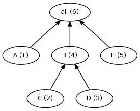
all: A B E A: ; # 3-minute job. B: C D ; # 1-minute job. C D: ; # 1-minute job. E: ; # 6-minute job.

Here’s the dependency graph for this simple makefile. The numbers in parenthesis indicate the serial order of the jobs in the build — the order the jobs will execute if the build runs serially:

Dependency graph for a simple build, with serial order marked

The serial order is also the order that make will start the jobs when running in parallel. For example, if we run this makefile with gmake -j 2, we would see the execution proceed as follows:

  • 0 minutes: gmake start jobs A and C.
  • 1 minute: C completes and gmake starts D (two minutes left on job A).
  • 2 minutes: D completes and gmake starts B (one minute left on job A).
  • 3 minutes: A and B complete, and gmake starts E.
  • 9 minutes: E completes, and the build ends.

Visually, it looks like this:

But this ordering is obviously quite inefficient. Job E is not dependent on any other jobs, so there’s no reason we can’t start it sooner. In fact, if we start E first, then the execution looks like this:

By starting the longest jobs first, we can trim the overall build time by an impressive 30%! So: obviously we can fabricate a build that shows significant improvement by use of a longest-job-first scheduler. But will we see similar results from real builds?

Look before you leap

To answer this question, I made a build simulator that simulates running a build using longest-job-first scheduling. The simulator uses job duration and dependency information from an annotation file generated during a real build with ElectricAccelerator, a high-performance gmake replacement.

I tested the longest-job-first scheduler on several builds:

  • MySQL
  • Samba
  • Mozilla

To my disappointment, the new scheduler showed no significant benefit on these builds:


Build times in real builds are virtually unchanged with the longest-job-first scheduler. On some of these graphs you can barely even tell there are two distinct lines!

What went wrong?

I think there are two factors that explain this lackluster result. The first is homogeneity: in most builds, the majority of the jobs are more-or-less the same length. For example, 90% of the jobs in the Mozilla build are less than 0.25s long. 80% of the jobs in the Samba build are in the 2.5s to 5.0s range. What difference does it make to choose job A or job B when they both have nearly identical durations? Now, maybe you’re thinking “A-ha! What about the link job? That’s definitely longer than the other jobs!” And it’s true, the link job often is longer. But by its nature it can’t start any sooner than after all the other jobs have finished anyway — so again the longest-job-first scheduler has no choice to make, because there is only one job to choose.

The second factor is the longest-job-first scheduler is smarter, but not smart enough: by considering only the length of each job in isolation, the longest-job-first scheduler cannot account for situations where a short job blocks a very long job. For example, suppose that we change our original example by adding a prereq for job E:

all: A B E A: ; # 3-minute job. B: C D ; # 1-minute job. C D: ; # 1-minute job. E: F ; # 6-minute job. F: ; # 10-second job.

Because job F is so short, the longest-job-first scheduler will never prioritize it over jobs A, B, C, or D — in fact, the scheduler won’t run job F until it is literally the only choice left. Unfortunately, that means that job E won’t run until the end of the build, clobbering our overall build time.

Where do we go from here?

From these simulations, it’s clear that there’s little point in pursuing a simple longest-job-first scheduler. But I think there may be something to the idea of a scheduler that considers not just individual job lengths but the relationships between jobs. I’ll explore that possibility in a future post.

How long are the jobs in my build? part 2

In response to my post about visualizing the lengths of the jobs in a build, one reader suggested a few tweaks to my gnuplot script to make the graph a proper surface plot. I like the look of this:

This version addresses some of the short-comings of my original:

  • It’s easier to determine the z-coordinate of a given point. In the original that was nearly impossible. It’s still a little tricky here because of the perspective, but it’s a step in the right direction.
  • Lower layers are not obscured. Originally, a dense layer of points could obscure points with a lower z-value. This version avoids that problem because you can see places where the surface dips.

Unfortunately, this version introduces some new problems:

  • Raw data points are averaged. In order to produce this surface plot, gnuplot computes a weighted average of the data points. Averaging itself is not necessarily a problem. The trouble here is that the layout of the data points is completely arbitrary, as you may recall from the previous post. That means that this plot effectively picks a handful of random data points, averages them, and plots the result. We still see the general trend — that most of the jobs are about the same length — but it feels a bit phony.
  • Implies patterns where there are none. When I first saw this image, I was struck by the “mountain range” running across the plot, a bit left of center. I hadn’t seen that in my original graph, so naturally I was intrigued. I spent hours trying to understand why that feature might be present, and finally came to this conclusion: it isn’t real. It’s just an artifact of the graphing method. Remember, the layout of the points is completely arbitrary, so it would be quite odd for there to really be a pattern like this cutting across the plot. In fact, I found that similar “features” appeared no matter what dimensions I used for the plot. I think the reason is that in this mode, gnuplot is not plotting the raw data, but rather a weighted average of adjacent points. This will tend to introduce relationships between those points that are not actually real.

OK, so this revised version is definitely interesting. I’m not sure that it’s better necessarily, given the defects I mentioned above. And unfortunately it doesn’t help at all with the issue of making something useful out of the X/Y coordinates. Nevertheless, thanks Aaron for the suggestion!